>> Manga Coloring Tutorial For GIMP
Over the past couple of months, I've been experimenting with coloring manga, and I found a style that i actually like. Also, my friend asked me how to color using GIMP so i thought i'd make a tutorial using my most well-known coloring.
go from this >> to >> to 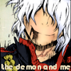
Made with GIMP 2.6.4 (Should Be Translatable)
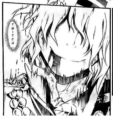
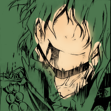
Level: Easy-Medium1. Start out with your base image.Mine was from a recent chapter in D.Gray-Man. Crop it however you like.
2. Erase all unnecessary parts such as speech bubbles.
3. Go to Colors>>Color To Alpha. Make sure that your alpha layer is the same color as your background/base (for manga, most of the time it is ffffff, but could be otherwise). This will then eliminate everything but the black lines. You can also Simply go to Mode>Multiply, but i find that Coloring To Alpha Works Better. This layer will ALWAYS be your top layer. Any layers added after this should be below it. It's also best to make a base layer that is a color you won't be using just to make sure you don't miss any spots. My computer won't save this step properly, so i can't show it right...
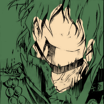
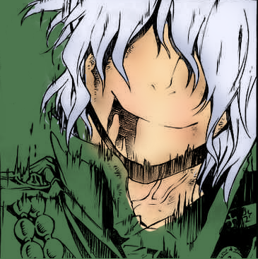
4. Add a new layer beneath the outline and select your skin color.I usually just use colors from an official scan to make sure it fits the character. i believe i used this image to get faddb3 as the base for Allen's skin. Use the brush tool to color everywhere there is skin. Your coloring doesn't have to be perfect since it will just be colored over further on.
5. Add another layer, but this time, use a darker color for skin. I used f8c995. Now go to your airbrush tool and use the largest fuzzy circle, but this isn't usually large enough. Scale it larger. This is so everything would be colored smoothly and evenly instead of making it obvious that you used a brush. Only color around places where shadows would fall (under hair, eyes, lips, neck, nose, ect.) and a tiny bit on the cheeks.
c
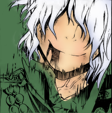
6. Allen's been fighting a lot, so he's going to be pretty dirty, so add a new layer. Then choose a brownish color, i chose a57753. Color where there are dirt marks around Allen (the lines under his mouth, ears) and also where shadows will fall.

7. Even though we're coloring manga characters, they need to have some pink in their skin so they look almost human. Add a new layer and use a pink color. I chose f25e60. Now click on Allen's cheeks, a spot on his neck, and by his nose. But the colors are way too bright and don't fit in! I decreaces the opacity to around 40% to make it blend in more.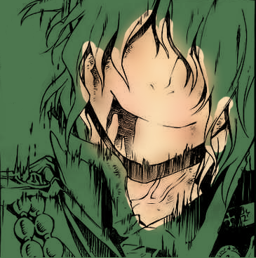
c
6. Allen's been fighting a lot, so he's going to be pretty dirty, so add a new layer. Then choose a brownish color, i chose a57753. Color where there are dirt marks around Allen (the lines under his mouth, ears) and also where shadows will fall.
7. Even though we're coloring manga characters, they need to have some pink in their skin so they look almost human. Add a new layer and use a pink color. I chose f25e60. Now click on Allen's cheeks, a spot on his neck, and by his nose. But the colors are way too bright and don't fit in! I decreaces the opacity to around 40% to make it blend in more.
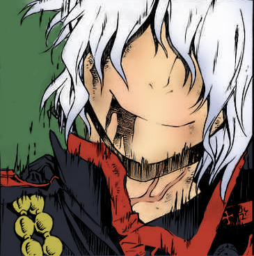
8. Add yet another new layer. This time, we're working on hair. Always do your base/shadow color first. Allen's hair tends to have a purple-ish shadow, so i used bcc2da. Color this layer in with a normal brush (unscaled).

9. Add a new layer. This will add variation to Allen's hair color. I used f0f2ff. Your color should be a lighter version of the color used in the previous step. Go back to your airbrush tool and select your fuzzy circle again.
10. Add yet another layer (this time, to make the final coloring of his hair). This will make it look like there is light hitting Allen. Select a color that is a lighter/brighter shade of your character's hair. For Allen, I used fdfdfd. We will be doing the same thing as the previous step with the large, fuzzy circle.
11. Next, add another layer. For this image, I used this layer for the vein throbbing out of Allen, but if you don't have those, I suggest using the layer as the base of the eyes. From this step on, you are simply coloring in all other articles. Make sure you do it layer by layer for each different color. If this were a normal coloring, I would do the layers as followed: whites of eyes, iris/eye color, base of clothes, collars, then pendants or other decoration.

12. Now, it's time to fix our mistakes such as colors that go outside the lines. When you start to erase, make sure you're on the right layer! Also, this is why our base color is different from colors we are using: so you can notice any gaps or mistakes. If you want to be sure that you do not have any more mistakes, change your base color around (sometimes neon/ colors work the best for this).
13. Add a texture! Find what texture you want as your background and add it ontop of your base. Now you're done with your coloring.

11. Next, add another layer. For this image, I used this layer for the vein throbbing out of Allen, but if you don't have those, I suggest using the layer as the base of the eyes. From this step on, you are simply coloring in all other articles. Make sure you do it layer by layer for each different color. If this were a normal coloring, I would do the layers as followed: whites of eyes, iris/eye color, base of clothes, collars, then pendants or other decoration.
12. Now, it's time to fix our mistakes such as colors that go outside the lines. When you start to erase, make sure you're on the right layer! Also, this is why our base color is different from colors we are using: so you can notice any gaps or mistakes. If you want to be sure that you do not have any more mistakes, change your base color around (sometimes neon/ colors work the best for this).
13. Add a texture! Find what texture you want as your background and add it ontop of your base. Now you're done with your coloring.
14. Now crop the part that you want to make into an icon (make sure that the dimensions are square!).
15. Right click your highest layer and click on "New Layer From Visible". This will make a new layer out of your whole image. This step is a lot easier than merging all your layers together.
16. Now, while using this layer, click on the scale icon (it's the small box with an arrow pointing to a larger box) and click on the two broken chains to put them together, this will make sure that your ratios stay the same everytime you reduce the size of your image. After doing so, slowly reduce the size of your icon. For example, if your image is 400x400 reduce to 300x300 to 200x200 to 150x150 to 100x100. If you scale like so, your icon will be less pixelized.
17. I added text to this icon so it would go under the lyric theme for an icontest. I'm not real good at adding text, so I can't write proper instructions for this. Anywho, just click on the text icon (the big A), click on the range you want your text to be put, write it in the pop-up box, and edit the font style and color however you like by using the bottom of the toolbox (please make sure that it is legible and flattering though). After you are done with this, you can move the text anywhere you like by just simply dragging it.
And now you are done!
Please leave any comments or questions. I would love to know what I can work on in my instructions if you need them.
I do NOT require any credit if you use this since I am just helping.
I would prefer if you left any comments here at my community.
1 comments:
THX DUDE HELP A LOT :DDDDDDDDD
Post a Comment